For many graphic designers, responsive design is an exciting new way to expand a site’s user base by catering to users with mobile devices and tablets. This can also bring in more customers and affect conversion rates for online merchants, seeing as how roughly half of online shoppers have used their smartphones to shop. However, our graphic design Los Angeles firm and our clients wanted to know: does responsive design affect SEO in any way? Fortunately, Matt Cutts of Google has answered that question for us.

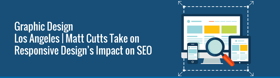
What’s Responsive Design?
Responsive design is basically a site design that automatically scales according to the specifications of the device viewing it. Laptop screens, monitors, tablet screens, and smartphone screens all have different sizes and dimensions, and previously graphic designers would have to create a separate site that is designed and optimized for viewing on each type of device. With responsive design, a designer can build one site and have it automatically scale for each device. In theory, the site should look good on whatever device it is viewed on.
Is SEO Affected by Responsive Design?
According to Matt Cutts of Google, the short answer is no. A site using responsive design has one URL, which then scales out to whatever specifications are needed for a given device. Both URL and the actual site content and organization remains the same, so there shouldn’t be any changes to elements of the site that would affect SEO.
Of course if you were building separate sites for each type of device, you’d want to make sure your content, organization, and URLs are consistent. Google also recommends having a rel=”canonical” command from the mobile site to the desktop site, among other things. You can check out their guidelines and best practices here.
Should You Use Responsive Design?
Everyone has different aims and objectives when building a website. If you want convenience and intend for your visitors to have the same experience regardless of the devices they are using, you’ll definitely want to check out responsive design. However, if you have a specific site experience in mind for say, a mobile phone screen or a tablet screen, you might want to build separate sites. Every design style has its respective pluses and minuses for a given situation. It just depends on what you are trying to do with your website. Our graphic design Los Angeles firm employs whatever method is appropriate for our client’s needs.
Professional Designers in Los Angeles
Looking for a professional graphic designer that can articulate your company’s vision in the form of a website? Not sure whether you should use responsive design? Are you certain the SEO on your website is as good as it can be? Let our graphic design Los Angeles firm do all of the heavy lifting. Coalition Technologies has built countless websites for countless businesses both large and small with great success. Give us a call today at 1-888-840-3469 and get your free quote.