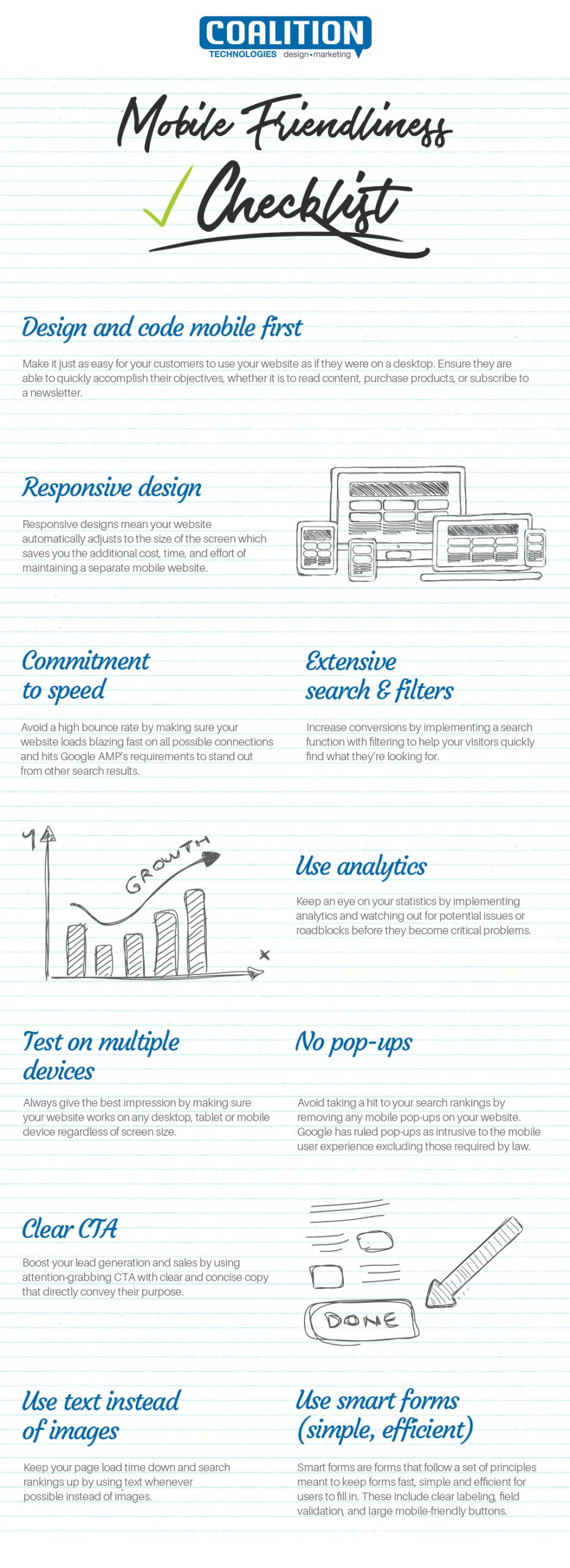
Whether you’re building your first site or upgrading your existing one, there’s a good chance many prospective customers will search for your products and services using a mobile device. What should you do to ensure your site is ready for these customers? Let’s go over a checklist of essentials you can use to make your website more mobile-friendly.
- Perform Mobile Coding First
Businesses want to get their new website up and running as quickly as possible. Consequently, they sometimes make the site live before coding it to accommodate mobile web browsing. The plan is usually to optimize the site for mobile devices after it’s optimized for desktops.
The rationale for the decision is often this: It makes sense to make a website live as soon as possible, so a business can start capturing online sales as quickly as possible.
However, when you consider that mobile users will visit your site once it goes live — and that they might not return if they find the site isn’t optimized for mobile — making the site live before coding for mobile could compromise revenue potential in the long run. This is why it’s a good idea to perform mobile coding first.
After your site is coded for mobile, test the results by accessing the website using smartphones, tablets, smartwatches, and other mobile devices your audience uses to find you on the web. If the mobile website is easy to navigate, loads in four seconds or less, and scales to fit the size of different smart device screens, you’ve hit the mark.
- Implement Responsive Design
Responsive design is a website development resource that makes a site easy to navigate using smart devices. The pages of a responsively designed website adapt to smart device screens in one of two ways: by resizing the website’s pages to make them fit the screen, or by automatically directing users to a version of your website specifically designed for mobile visitors.
When it comes to site navigation, the second option is typically best. It allows visitors to start surfing a mobile website without zooming in to read headers and other text while simultaneously having to scroll left and right. Instead, a responsive mobile design can adjust font sizes and design components so that they fit seamlessly within a variety of screens.
- Test Website Loading Speed
Websites load at different speeds based on several factors, including page content (e.g., image-heavy pages load slower), the speed of the internet connection, the browser one uses, and whether the site is loaded in the browser cache.
If a website loads in less than four seconds, its bounce rate — the percentage of visitors that abandon the site after viewing one page — should be less than 20%. If the site is at the opposite end of the spectrum, requiring, say, 10 seconds to load, the bounce rate rises to roughly 40%.
- Include an On-site Search Tool
An on-site search feature lets visitors search your website using popular terms, reducing the time it takes to find what they’re looking for. An on-site search field that filters results based on keywords essentially serves the same purpose as a public search engine, but with a much more targeted way of directing visitors to content, products, or services they’re seeking.
Within your website, using search filtering helps you achieve a low bounce rate. Visitors want your site to load fast, then they want to find what they’re looking for quickly. By fulfilling both of those needs, you’ll be able to entice visitors to stay on your site, increasing the likelihood of converting browsing visitors into dedicated clients or customers.
- Use Clear Calls-to-Action
A call-to-action is action-oriented copy that directs website visitors to take the desired action, such as making a purchase or leaving contact information.
Calls-to-action should be organically-written and inviting as forced, overly promotional copy will do little to convince site visitors to take action. Generally, a call-to-action after any segment of information (blog, “about us” section, category pages, etc.) that communicates at least one unique value proposition (UVP) for investing in what you offer.
- Avoid Unnecessary Pop-Ups
While action-oriented pop-ups such as newsletter sign-ups or discount promotions can help increase engagement and sales, pop-ups also slow down the web browsing experience and can lead to page abandonment.
Based on research from SEM guru Mark Traphagen, annoying pop-up advertising is the primary reason people block a website. At the same time, roughly 70% of Americans say they’re annoyed by irrelevant pop-ups.
Pop-up ads aren’t inherently bad. They’re actually quite useful for capturing sales from refined web traffic whose buying interest is high. The key is to make pop-ups highly relevant to your audience — a task for which a digital marketing firm can provide invaluable assistance.
- Use Smart Forms
Most visitors want their web browsing experience to be as passive as possible. They don’t want to encounter disruptive pop-ups, and they definitely don’t want to fill out information forms that feel more like surveys than requests for contact information.
Using smart forms, which follow a set of principles that expedite accessing and filling out forms, takes care of the second problem. As for what the principles should be, it varies based on the type and depth of information you need to collect. But keep this in mind: The fewer pieces of information you collect, the more likely visitors are to provide the information you need.
- Implement Analytics
After your site is up and running, it’s important to use a website analytics program that measures site performance across a broad range of metrics, including web traffic sources, page loading speed, bounce rate, exit pages, new visitor and return visitor conversion rates, and many more.
Continually keeping tabs on how your site operates is a bit like preventive maintenance. You often discover problems before they’re out of control and require a temporary shutdown until they’re resolved.
About Our Company
Coalition Technologies is an industry-leading digital marketing firm specializing in custom website development, content creation, search engine optimization (SEO), and other services for creating websites that capture online sales and/or contact information for leads.
To learn more about our website development services, call us today at (310) 928-6472, or send us an email through our contact form. We look forward to learning about your business’ online growth and seeing how we can help you succeed!