
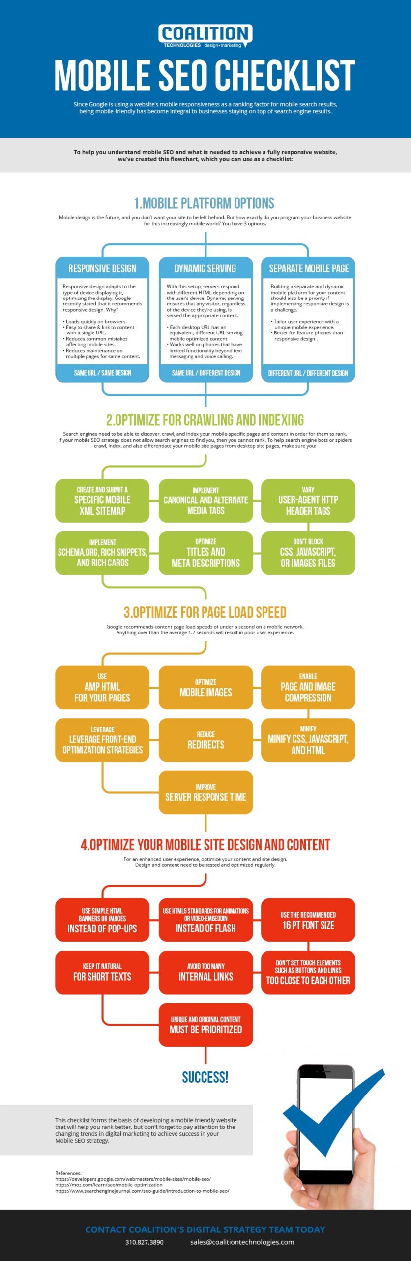
Since Google is using a website’s mobile responsiveness as a ranking factor for mobile search results, being mobile-friendly is the key to businesses staying on top of search engine results.
To help you understand mobile SEO and what is needed to achieve a fully responsive website, we’ve created this checklist.
Mobile Platform Options
Responsive Design
Responsive design adapts to the type of device displaying it, optimizing the display. Google recently stated that it recommends responsive design. Why?
- Adapts to the type of device displaying it
- Loads quickly on browsers
- Easy to share & link to content with a single URL
- Reduces common mistakes affecting mobile sites
- Reduces maintenance on multiple pages for same content
Dynamic Serving
With this setup, servers respond with different HTML depending on the user’s device. Dynamic serving ensures that any visitor, regardless of the device they’re using, is served the appropriate content.
- Only one URL per page – Each desktop URL has an equivalent, different URL serving mobile optimized content
- Works well on phones that have limited functionality beyond text messaging and voice calling, but have some web browsing capabilities.
Separate Mobile Page
Building a separate and dynamic mobile platform for your content should also be a priority if implementing responsive design is a challenge.
- Tailor user experience with a unique mobile experience
- Better for feature phones than responsive design
Optimize Your Mobile Sites for Crawling and Indexing
Search engines need to be able to discover, crawl, and index your mobile-specific pages and content in order for them to rank. If your mobile SEO strategy does not allow search engines to find you, then you cannot rank.
To help search engine bots or spiders crawl, index, and also differentiate your mobile-site pages from desktop site pages, make sure you:
- Create & submit a specific mobile XML sitemap
- Implement canonical and alternate media tags
- Implement header-tags to let Google know when to deliver a mobile version or desktop version of your site
- Don’t block CSS, JavaScript, or images files
- Optimize titles and meta descriptions to improve your mobile SEO strategy
- Enhance optimization results by implementing schema.org, Rich Snippets, and Rich Cards through the use of structured data markup
Optimize for Page Load speed
Google recommends content page load speeds of under a second on a mobile network. Anything lesser than the average 1.2 seconds will result in poor user experience.
- Use AMP HTML for your pages
- Optimize mobile images
- Enable page and image compression
- Minify CSS, JavaScript, and HTML in your mobile pages
- Reduce redirects
- Leverage front-end optimization strategies
- Improve server response time
Optimize Your Mobile Site Design and Content
You have to optimize your content and mobile site design to ensure an enhanced user experience. Design and content need to be tested and optimized regularly.
- Use a simple HTML banner or image instead of a pop-up
- Use HTML5 standards for animations or use video-embedding that’s playable on all devices instead of Flash
- Use the recommended 16 pt
- Don’t set interactive touch elements such as buttons and links too close to each other
- Avoid too many internal links
- Keep it natural for short texts
- Unique and original content must be prioritized
To achieve success in your Mobile SEO strategy, it’s prudent that you pay attention to the changing trends in digital marketing. This checklist forms the basis of developing a mobile-friendly website that will help you rank better.