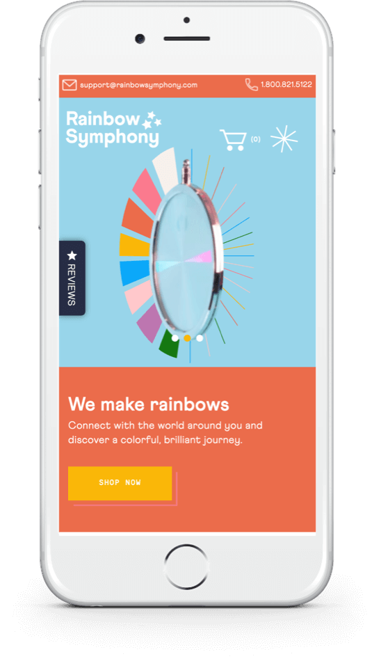
Mobile hasn’t outstripped desktop as the main platform for online purchases — yet. But it’s getting close.
Mobile devices already account for half of all ecommerce traffic and are projected to drive 43.4% of all ecommerce sales in 2023. As many as three-quarters of visitors think twice about returning to a website that isn’t mobile optimized — if they can find it again. By default, Google now indexes the mobile version of a site first for inclusion in search results.
This means that if your Shopify store isn’t optimized for mobile, it’s not ranking as well as it could be.
Optimization goes beyond just making your site responsive. It’s providing an intuitive interface and an outstanding experience for your prospects that make up for the lack of a wider screen as they’re shopping. Your choices have to be carefully thought-through to deliver a seamless customer journey and replicate the convenience of a desktop.
Here’s how to cover your bases when designing a website for mobile.
Table of Contents
Tips to Optimize Your Shopify Store for Mobile Devices
Pay Attention to Page-Load Times
Whatever you do, don’t ignore speed optimization for your Shopify store. On mobile, people don’t have the option of switching to a different tab while they wait for one to load. Not that they’re likely to do that anyway.
The probability of a user bouncing from your website increases by 32% if your page load speed so much as exceeds one second. What’s more, it’ll also affect your Shopify site’s SEO. Page load times figure into Google’s algorithm for search rankings. There are several ways to optimize your page-load time, including choosing quality hosting, compressing images, leveraging a Content Delivery Network (CDN), and more.
The availability of choice and conscious shopping patterns have ensured that customers never miss an opportunity to browse elsewhere before they settle on a purchase. This is fairly easy on a desktop with the additional screen space to accommodate navigation options and the possibility of having several tabs open simultaneously.
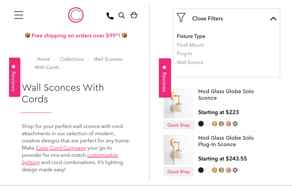
It’s a little less convenient on a phone since there’s much more scrolling and swiping involved to access the right content or even the navigation bar. Something like a collapsible, sticky navigation bar does the same job.
A great way to go about it is to have a hamburger menu on every page. Breadcrumbs, smart-search functionality, and mobile-friendly product filters are also helpful for users to navigate Shopify stores on mobile. As an example, Color Cord implements these features for a scroll-friendly user experience.
Product Photography
People tend to shop with their eyes. In fact, 75% of online buyers rely on product photos to make a purchase decision — and this is true on mobile more than anywhere else.
If you run a mobile Shopify store for products such as health supplements, produce, or condiments, make sure you have convenient high-res zoom enabled so that customers can browse the product labels and ingredients. Just because your customers are on mobile doesn’t mean they’re any less quality-conscious.
Now that you’ve optimized for human visitors, don’t forget about the search engine bots. Optimize your images for SEO by reducing the file size, incorporating alt text, and using a keyword-rich filename. For instance, the filename double-waist-wide-leg-jeans is more valuable for SEO than productphoto1.

Adjust Videos for Smaller Screens
Videos are a big part of the ecommerce shopping experience. It’s second nature for a shopper to click on an available product video before going through reams of text.
Demo and product showcase videos help your customers get a better sense of whether the product is a good fit for them or not. On-site videos can add SEO value, too. While a video carousel in Google’s search results page will include YouTube videos, a video rich snippet will direct traffic to your site. There’s also the indirect benefit of improving dwell time on your Shopify site — customers will stay on the page longer to watch a video, which can boost your page’s ranking.
If you have videos integrated on your Shopify store, make sure they’re optimized for mobile. Video players that are inconvenient to access or keep glitching out will only add to shopper frustration and lead to an abandoned cart.
Rethink How You Position Your Text
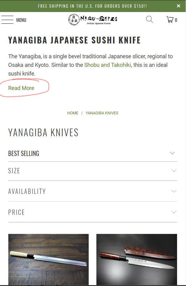
Traditionally, store owners believe more detail is better than less when it comes to online shopping. Copy also helps SEO, so, on Shopify, the more opportunities you take to optimize your text with keywords, the more likely you’ll build organic ranking.
However, you should try to resist the temptation to clog up screen space when it comes to mobile. As we’ve already established, so much of shopping and browsing is a visual experience. The more text you have, the more your prospects have to scroll to get to the product photos.
This is where there’s a diminishing return on copy. It’s important to add a product description, but it should not come at the expense of your user experience. A good target for product pages is to include about 200-300 words in the description, remembering that you can break up the text with bullet points for more visual appeal.
Include the absolute essentials for mobile users on your Shopify store, such as product name, price, specifications, and calls to action. If you need to add more text, on your category pages, for instance, consider collapsible descriptions and menus.
Also, consider increasing your font size from the 12-point desktop standard. Something between 14 and 16 pixels is ideal so that customers don’t have to zoom in and zoom out as they’re scrolling. Choose traditional fonts for your text. There’s a chance unconventional ones might not display properly on certain devices.
Keep Your CTAs Visible
The right CTA strategy can be a powerful catalyst for on-page conversions on your Shopify store. On mobile, it might be a good idea to experiment with sticky CTA buttons that follow the user as they scroll. This helps streamline the user journey and reduces the risk of a user leaving your store for lack of a prompt.
If you’ve A/B tested it and found a fixed one works better, make sure it stands out. CTAs that feel less cluttered and are surrounded by more white space can increase conversions significantly.
Make your CTA big enough so that it’s easy to tap. Do this for all the buttons on your Shopify store so that mobile users don’t have to fiddle with devices to access features.
Put some thought into what you want your CTA to say as well. Depending on what your product is, you could forgo the classic ‘Add to Cart’ or ‘Buy Now’ for something more creative like ‘Get the Look,’ ‘Treat Yourself,’ or even customized ones like ‘Hurry! Get It Now!’ for products with limited stocks.
Ditch the Pop-Ups
Pop-ups can often feel like a harmful addition to pages, even on desktops, and are generally bad for business on mobile sites. A random pop-up banner that overlays the screen can be annoying when it suddenly covers up on-screen content. If the user can’t close it quickly, perhaps because of a UX glitch, it could easily be a lost sale. Too many instances of this will create a high bounce rate, which could harm the page’s organic ranking.
Mobile users aren’t likely to sign up for newsletters anyway as they’re browsing your Shopify store. Offer them the chance via email when they sign up for an account. And if you have a discount you’d like to highlight, add a quick note under your CTA rather than a pop-up banner. This’ll help keep the user journey going and direct the customer to where you want them to go — the checkout cart.
Optimize Checkout For Mobile
You’d be surprised at how much money gets left on the table because Shopify store owners don’t streamline checkout for mobile users. The average cart abandonment rate among online shoppers is nearly 70%. This is a real waste when you’ve done all the hard work to bring the prospect to your site.
There are a number of ways to make checkout easier for your shoppers. Minimizing the amount of information they have to input in forms is top of the list. Asking for more data takes longer, brings up more privacy concerns, and increases the chances of the user bouncing off. Consider options like letting new users sign up with their Google or iOS account and automatically pulling form data from the browser where users have this enabled.
Offer your customers more region-specific payment options and highlight this in the interface. You might also want to add some trust icons throughout your checkout process to indicate that your Shopify site is secure. Security is still a top concern for mobile users, with as many as 31% indicating it’s why they don’t buy on handheld devices.
Work With Shopify Experts for an Outstanding Mobile Store
We’re fast approaching the point where websites are designed to be mobile-first and optimized for desktop. Future-proof your ecommerce site with the help of experts who know what they’re doing when it comes to web design. At Coalition, we’ve built some 800 websites and earned our clients over half a billion dollars of revenue.
Whether you’d like to set up a mobile-first Shopify store from scratch or optimize your existing one and drive more SEO value from it, we can help. Glance through our work or reach out for a free consultation today.