
Experts estimate that around 75% of your website’s credibility originates from its design. Intelligent and responsive designs guarantee a great first impression for every visitor, converting that impression into a seamless user experience and, ideally, a conversion. Web design mistakes, even minor ones, can significantly dampen the user experience and harm conversions.
Use this guide to learn about the top website design mistakes and how to beat the competition with smarter design.
Table of Contents
Inaccessibility
The W3C defines web accessibility as a state where people with disabilities can completely utilize online tools and websites to their full ability. In effect, this means that people should be able to understand the contents of your website and interact with everything it offers.
Avoiding this website design mistake benefits everyone, not just the differently-abled. For example, building a more accessible enterprise website with features like text magnification, alt-text, and reader mode benefits its usability for all users, improving its reputation and SEO value. The W3C breaks accessibility down into a few components:
- Content such as text should be easily readable across devices. Avoid disguised text prompts (dark patterns). Images should include descriptive alt-text.
- Assistive technology should be enabled, including screen readers, alternative input methods, and scanning software.
- Developers, coders, and designers should allow for the input of experts with disabilities who can contribute content.
- Evaluation by automated tools and other third parties that can ensure accessibility.
Slow-Loading Pages
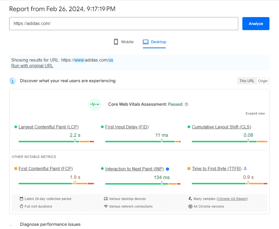
Slow-loading pages have been at the top of the list of website design mistakes to avoid for years, and yet it remains a challenge for small businesses even today. A website that takes too long to load can frustrate and drive away users who expect a fast and smooth browsing experience.
For example, building a website with too many unoptimized images or videos can drastically increase page load times. Slow load times are a web design mistake that can even be an issue for pages that don’t have too many media elements if they don’t use caching or other minification techniques.
Google’s analysis reveals that 53% of visits are abandoned if a page takes longer than three seconds to load. Here’s how to avoid this website design mistake:
- Reduce redirects that can add additional HTTP requests.
- Compress your images with a tool like JPEG Optimizer.
- Choose a reliable hosting solution that can help you optimize your website’s performance.
- Minify HTML, CSS, and JS files, removing unnecessary spaces and characters.
- Use testing tools like PageSpeed Insights to keep an eye on your website’s performance and identify issues quickly.
Vague Calls-To-Action (CTAs)
A vague or generic CTA is a top website design mistake that can immediately cause visitors to distrust your brand and website. Vague CTAs, even harmless ones, can be considered an example of dark patterns. Dark patterns are user interfaces designed to coerce users into taking actions they might not have intended to take using misleading tricks.
You’ll want to avoid this website design mistake, as many businesses can fall into this trap without even realizing it. Common CTAs like “View More” are good examples of this. A user clicking on a button with this CTA won’t know if it prompts another popup, expands a text bubble, or leads to a product page. Use specific and personalized CTAs like “Start a Free Trial” that are specific about their intent to guide your users through conversion points.
Vague Messaging
Vague messaging is a web design mistake that refers to unclear and ambiguous website content. Being ambiguous with your messaging represents a marketing failure since your visitors will be unable to understand your brand and the products it offers. Ultimately, users will deem your page irrelevant and click off within seconds.
You must be direct with your messaging to avoid this website design mistake. Your brand’s values and the products it offers should be communicated instantly through effective web design. Users shouldn’t have to click around after landing on your page to figure out what it’s about.
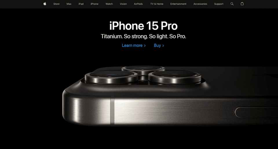
Apple’s homepage is a good example of this philosophy. Despite the brand’s emphasis on minimalism, it can highlight its flagship product and its main features in the hero banner. This example shows off the brand’s confident tone and the product’s reliability, offering users a clear way forward if they want to learn more about it.
Too Much Text
Brands chasing after SEO often forget to avoid this website design mistake, filling their pages up with keyword-loaded text that is illegible and hard to look at. Users tend to quickly scan web pages rather than read them word by word, so large chunks of text can seem unappealing and uninteresting. Chunks of text can also affect the readability and accessibility of your website, especially on mobile devices, where the screen size is smaller, and the text can appear distorted or illegible.
To avoid this website design mistake:
- Use bullet points to break up paragraphs.
- Use concise language that conveys more with less.
- Break up longer pages with accurate and descriptive subheadings.
- Include a table of contents that allows for easy navigation between those headings.
- If possible, use images and video content to supplement your content.
Non-Responsive Design
Non-responsive web design is a top website design mistake caused by oversight or a lack of resources. Responsive web design is a design philosophy that can help you avoid this website design mistake by ensuring a consistent user experience across a range of different devices. According to this approach:
- Your website layout should adapt to suit different screen sizes.
- Images and videos should also shrink or enlarge depending on the user’s device.
- Every visual element should load just as quickly, regardless of the device.
Missing out on responsive web design leads to a frustrating user experience, requiring users to pinch to zoom and scroll horizontally to use a website.
Cluttered Interfaces
This web design mistake can make your website unusable for some visitors. Cluttered interfaces are a common website design mistake to avoid, featuring a jumble of visual elements like text or menu buttons that create an overwhelming impression on the visitor. This clutter usually happens when businesses try to do too much with limited page space, and it can also affect your website’s performance and SEO.
You can get around this by properly utilizing negative space on your pages. Let the blank spaces naturally guide the visitor from one end of the page to the other, using bold and contrasting colors to pave the way. Images and videos should be used only where necessary and relevant to the page.
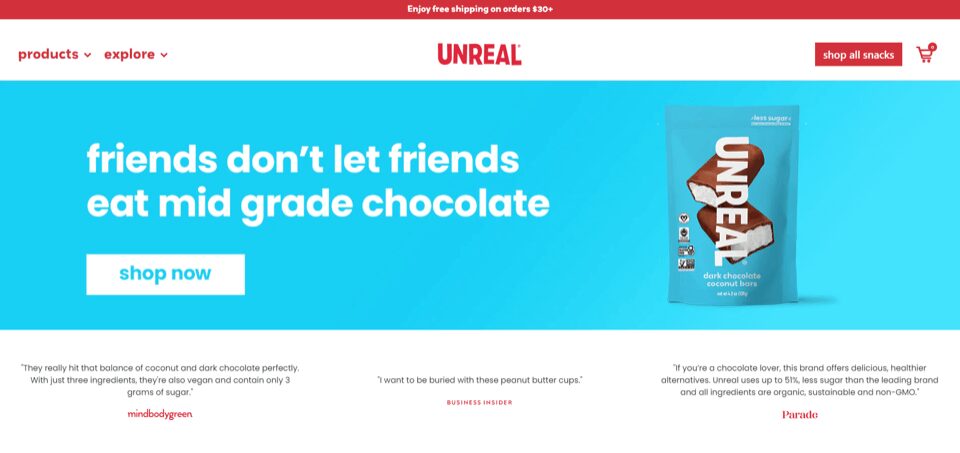
A well-designed interface can boost conversions by up to 200%, so cluttered interfaces should be a key website design mistake to avoid for any growing business. Unreal Snacks’s interesting homepage tackles this challenge with clarity. The bold colors help create a sense of space on the page, driving our attention to their main product immediately.
Not Understanding The Audience
Misunderstanding, or not having a target audience at all, is a massive web design mistake that can affect almost every aspect of your website. Your target audience and its preferences should be a key consideration before design decisions are made. For example, younger audiences might be more engaged by dynamic and flashy animation web design trends, while older demographics could prefer a more no-nonsense and direct approach.
If you do not know how to avoid this website design mistake, you might introduce elements that can drive away your target audience and increase page bounces. Use these tips to steer clear of this web design mistake:
- Study your competitors and use surveys to find the most effective target audience for your business.
- Build detailed user personas that represent that target audience. These personas will help you make better decisions later on. You can also use tools like Shopify Audiences to improve ad targeting once you’ve determined who your audience should be.
- Use A/B testing to choose between competing visual elements. Data-driven decisions tend to perform better long term.
Understanding your target audience will inform your web design choices and improve your marketing, helping you find better audiences that are more receptive to your messaging.
Build a Better Website in 2024
Learning how to avoid website design mistakes can be a deceptively simple process if you know what to look out for. Fixing these mistakes can help you build a website that truly embodies your brand’s unique vision and becomes an invaluable tool that can increase sales effortlessly.
If you’d like any assistance building that ideal website for your business, contact Coalition Technologies today for a free consultation. Our expert designers have built thousands of high-impact web design experiences for clients, multiplying revenues using market-tested strategies.