The Rundown
- Launched April 21, 2026, ChatGPT Images 2.0 uses gpt-image-2 model for superior instruction-following, text rendering, layouts, flexible sizes, and 2K resolution.
- ChatGPT Images 2.0 excels in small text, icons, UI elements, dense compositions, consistent characters across images, and mimicking real marketing materials using references.
- Claude Design, launched April 17 by Anthropic, generates editable prototypes, mockups, slides via conversational prompts.
- AI imitates professional design patterns via statistical prediction but lacks human intentionality, design theory, psychology, and strategic judgment.
- Effective design accounts for audience needs, viewing context, UX factors like accessibility and conversions. AI doesn’t understand these nuances.
- Coalition Technologies’ testing found GPT Image 2 produced stronger banner designs than GPT Image 1.5, but still required human review.
- AI design tools work best for ideation, first drafts, and faster iteration, not as a replacement for professional design judgment.
Until very recently, AI-generated designs like flyers, banners, social posts, and mockups were easy to spot. Even as AI got better at generating images with readable text and without uncanny-looking (and often nightmare-inducing) people, it still failed at things like layout, hierarchy, spacing, consistency, continuity, and following specific creative direction. Well… it seems like maybe not anymore.
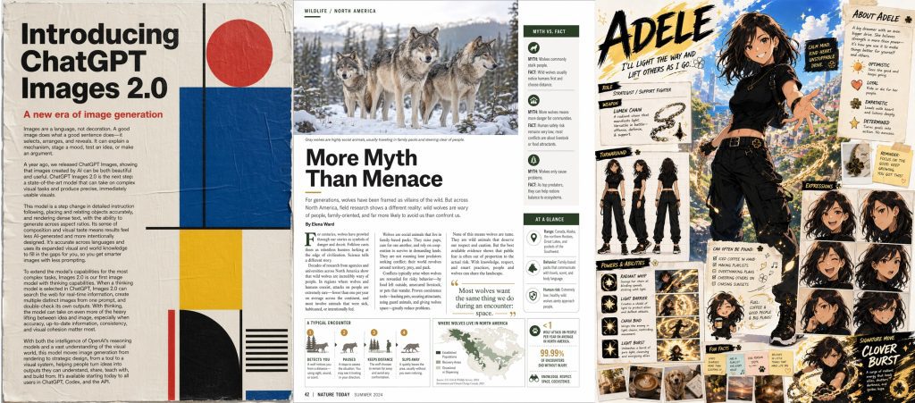
On April 21, 2026, OpenAI released ChatGPT Images 2.01, powered by the new gpt-image-2 model, which OpenAI describes as its most capable image model yet2, with stronger instruction-following, better text rendering, improved layouts, more flexible image sizes, and support for images up to 2K resolution. Around the same time, Anthropic launched Claude Design, a dedicated AI-powered design tool built for prototypes, slide decks, one-pagers, and other structured visual work.
The first reactions to both releases have been loud and enthusiastic, to put it lightly. Which raises the question: is AI finally good at design? Or even, will AI really replace designers?
Table of Contents
What is ChatGPT Images 2.0?
GPT Image 2 is the next major release in OpenAI’s native image generation model line. Its predecessor, GPT Image 1, launched in March 2025 and marked a real break from what came before it.
ChatGPT had offered in-chat image generation since 20233, when DALL-E 3 was integrated into it, but that version still functioned more like a separate tool tacked onto the chatbot. GPT Image 1 launched to immediate mass adoption, with more than 130 million users creating over 700 million images in its first week4, and moved image generation into the model itself, making it native to ChatGPT.
GPT Image 1.5 followed in December 2025, mainly improving generation speed rather than meaningfully improving the quality of what the model could produce5.
Released just two days before GPT-5.56, OpenAI’s new LLM for more complex text-based work, GPT Image 2 is its counterpart for image generation. Instead of a small version bump, it’s supposed to be a substantial rebuild.
What Makes ChatGPT Images 2.0 Different?
Tools like Midjourney and Google’s Nano Banana could already create realistic-looking photography and convincing illustrations, but struggled with practical graphic design work.
ChatGPT Images 2.0 is better at exactly the things that made previous AI image models unreliable for producing out-of-the-box design work: small text, iconography, layouts, UI elements, dense compositions, multi-panel scenes, consistent characters, and generating assets that resemble real marketing materials.
OpenAI’s examples include posters, infographics, product-grid layouts, magazine spreads, and visual explainers. And they are undoubtedly impressive.
If you have ever tried to generate that kind of work with older AI image tools, you know that the output could look decent at a quick glance, only to fall apart under closer inspection. Details were often distorted, layouts inconsistent, text warped, styles mismatched, and most instructions ignored.
ChatGPT Images 2.0 reduces a lot of those obvious tells. It is also better at following reference files and stylistic instructions, including colors, typography, layout direction, and brand cues. With thinking enabled, it can generate up to eight images at once while maintaining the same characters, objects, and style across them. It also supports wider and taller aspect ratios, from 3:1 to 1:3, and can generate images up to 2K resolution7.
Claude Design Pushed the Same Question
ChatGPT Images 2.0 is not the only reason people are asking whether AI can do design now.
A few days earlier, on April 17, Anthropic Labs launched Claude Design8, an AI application that allows users to create visual assets like prototypes, website and app mockups, marketing materials, and slide deck presentations through a conversational interface. Powered by the Claude Opus 4.7 model, it transforms natural language text prompts into functional designs that can then be refined through conversation, inline comments, direct text edits, and custom sliders, or moved into tools like Figma9 or Canva for more traditional design editing.
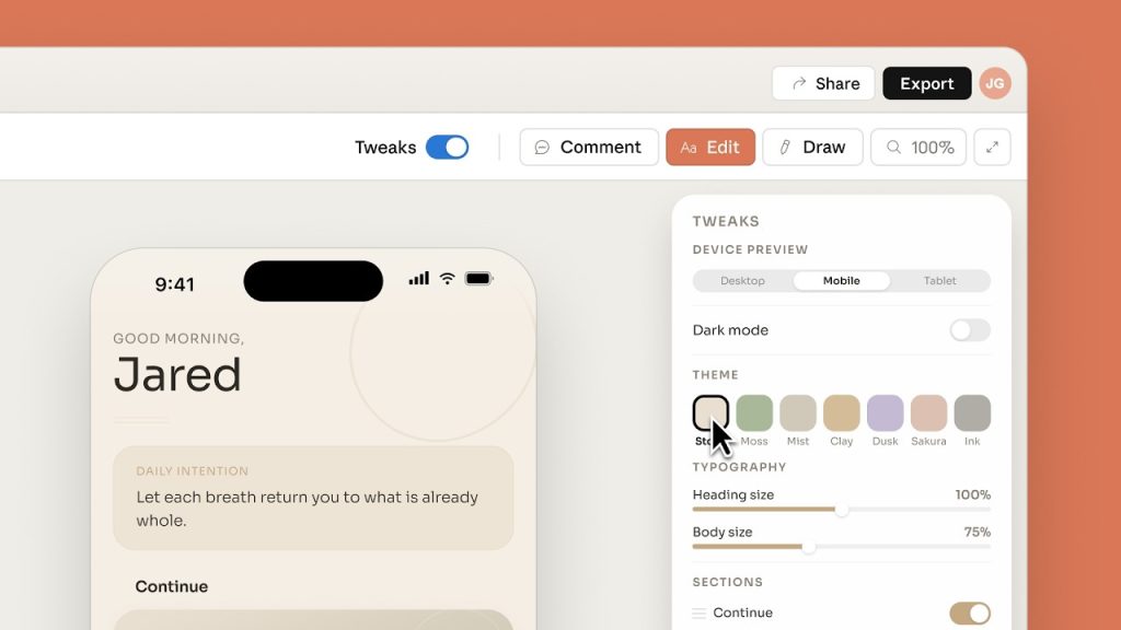
Available only to Claude Pro, Max, Team, and Enterprise users, Claude Design is a very different product from ChatGPT Images 2.0. While one is an image generation model, the other is closer to a dedicated design tool. But they both point toward the same shift: prompt-based design is here.
So if ChatGPT Images 2.0 can generate polished designed-looking assets, and Claude Design can turn a prompt into an editable prototype, designers are officially done, right? Not really.
Looking Designed is Not the Same as Good Design
With a strong prompt and the right reference assets, ChatGPT Images 2.0 and Claude Design can produce results that an untrained eye may mistake for professional design work. But generating something that looks designed is not the same as understanding design.
AI models like these are trained on millions of visual examples, so they can learn what a good website, poster, flyer, ad, or social graphic tends to look like. With that pattern recognition, they can imitate alignment, negative space, type scale, cohesive color palettes, clean layouts, and other patterns associated with professional design.
But the model is not making design decisions the way a designer does.
Modern AI image generators use generative architectures that function more like sophisticated statistical prediction engines than traditional designers. In simplified terms, these models learn the structure of visual information from massive datasets, whether by reversing digital noise (as in the process called diffusion) or by predicting sequences of visual patterns (as in autoregressive modeling). When a user enters a prompt and provides reference files, the model generates an image by using learned patterns to estimate what should appear where.
That is fundamentally different from a human creative process, which is based on intentionality, learned theory, practiced technique, and lived experience.
The Decisions Behind Great Design
When designers make decisions about layout, hierarchy, typography, color, and image selection, those choices are based on strategy, design theory, and human psychology. They are balancing contrast, alignment, proximity, repetition, negative space, and visual hierarchy to guide the viewer’s eye and make the asset easier to understand. Those choices help prioritize the most important message, improve legibility, and make the design feel cohesive.
Beyond that, they have to think about the underlying meaning of their choices. Things like color and font aren’t just there to look pretty, but are active tools used to trigger a specific feeling or make a brand instantly recognizable.
What makes a design “good” is not whether it looks good, but whether it does the job it was created to do.
A flyer, email banner, landing page hero, billboard, app interface, product label, and social ad each come with different goals and viewing contexts. A layout that works on a website may break in an email. A billboard with too much information or text that is too small will not be readable from a moving car. Print materials need to account for trim, bleed, color profiles, paper stock, and production requirements. And the target audience adds another layer of complexity on top of that.
For websites and apps, design decisions are also UX (user experience) decisions. Designers have to account for navigation, readability, accessibility, mobile responsiveness, interaction states, form friction, page speed, and conversion paths. A screen can look polished and still be confusing, inaccessible, difficult to use, or ineffective at driving sales. In that case, the design has failed, even if it “looks nice.”
Effective design requires judgment. It requires knowing what to emphasize, what to remove, what the audience needs first, what the brand should avoid, and where a visual choice helps or hurts the business goal.
That is where the AI models still struggle.
ChatGPT Images 2.0 Still Makes Mistakes
In our own Coalition testing, ChatGPT Images 2.0 was clearly better than previous models, but it still made some basic mistakes.
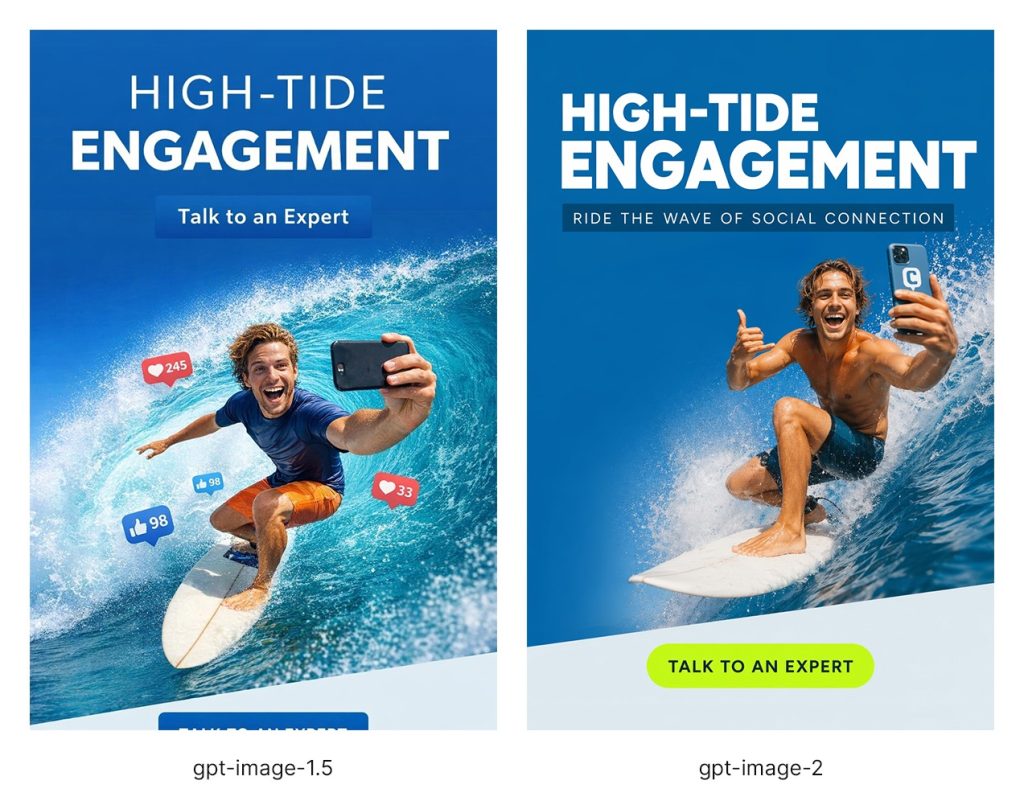
The test used the same prompt in both models: create an email banner in the style of the reference images (8 designs were provided to assess how well each model could follow an existing visual style), using the same color palette and font, with the headline “High-Tide Engagement,” the CTA “Talk to an Expert,” and an image of a surfer riding the top of a wave while taking a selfie for social media.
The difference is clear. The gpt-image-1.5 version understands the broad idea, but the output feels less controlled and much less branded. It created two different CTA buttons (one partially cropped off at the bottom), added elements that were not requested (the floating “like” icons), included a surfer with distorted proportions, and failed to closely match the visual style of the reference designs.
The gpt-image-2 version is much closer to a usable designed asset, with a stronger headline, cleaner composition, clearer CTA, and a more intentional layout. More importantly, it gets the provided style almost spot on, making the output feel like it belongs to the same campaign rather than a loosely related AI variation. It even added the logo on the phone, which was a very nice and unexpected touch.
However, the gpt-image-2 version still shows why AI-generated design needs human review.
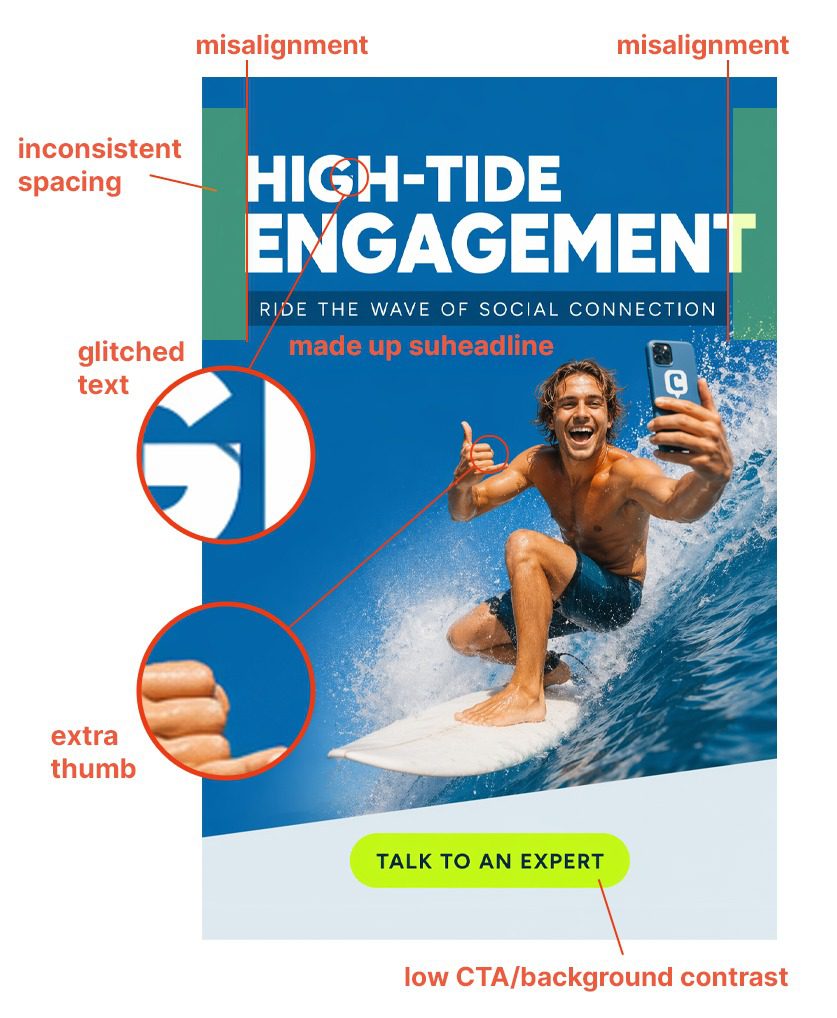
At first glance, it looks polished, but closer inspection reveals several issues.
- The text style is much closer to the provided samples, but the headline has a glitched letter “G,” the alignment is off, and the spacing is inconsistent. The model also added an unrequested subheadline.
- The CTA is also much closer to the sample style. It is not duplicated or cropped, but its color has low contrast against the pale background.
- The surfer looks much more natural and photorealistic, but he still has an extra thumb, which is a very obvious AI tell.
These kinds of details might go completely unnoticed by a non-designer, but are the sorts of things that separate a convincing AI mockup from a production-ready, effective design.
In-depth analysis of Claude Design shows a similar pattern. In hands-on tests, the tool was often able to produce impressive-looking first drafts, including slide decks, landing pages, app screens, and simple animations, but the outputs still tended to break down when judged as real design work. Reviewers point to generic layouts, weak contrast, odd spacing, missing or arbitrary information, poor brand adherence, font mismatches, broken logo recreation, slow revision cycles, and exports that don’t always preserve editability or formatting cleanly. Usage limits make those issues even harder to work around, since users can run out of credits before finishing the cleanup that the AI-generated drafts require.
So no, AI is not replacing designers any time soon.
Get smarter creative with human design judgment.
The Better Way to Use AI in Design
The takeaway is not that ChatGPT Images 2.0 and Claude Design are useless, or that they cannot help designers and non-designers. They can.
But businesses should not confuse access to better AI tools with access to better design for cheaper.
Weak design still costs money, even when it looks decent. An AI can generate something that looks polished, but it cannot reliably decide whether the asset fits the brand, speaks to the right audience, supports the offer, follows platform requirements, or moves users toward the right action. A confusing landing page can reduce conversions. A poorly structured email can lose clicks. A social ad can look impressive and still fail to communicate the offer. A brand asset can feel “good enough” internally while making the company look generic to customers.
These tools are also only as good as the prompt, the reference material, and the QA process behind them. That is exactly where designers are better equipped to guide the output, catch the issues, and decide what is actually ready to publish.
At Coalition Technologies, we use AI to explore more design directions, create stronger first drafts, expand the range of creative options, and stretch client budgets further. And we do it without lowering our standards. If you’re looking for an agency that brings the skills, knowledge, experience, and accountability that AI tools cannot provide, get in touch with us.
Sources:
- https://openai.com/index/introducing-chatgpt-images-2-0/ ↩︎
- https://developers.openai.com/api/docs/models/gpt-image-2 ↩︎
- https://en.wikipedia.org/wiki/DALL-E#DALL-E_3 ↩︎
- https://openai.com/index/image-generation-api/ ↩︎
- https://www.reddit.com/r/ChatGPTPro/comments/1pu98rm/since_image_15_image_results_feel_worse_how_are/ ↩︎
- https://openai.com/index/introducing-gpt-5-5/ ↩︎
- https://www.theverge.com/ai-artificial-intelligence/916166/openai-chatgpt-images-2 ↩︎
- https://www.anthropic.com/news/claude-design-anthropic-labs ↩︎
- https://www.figma.com/blog/introducing-claude-code-to-figma/ ↩︎