

- URL : https://www.johncgaragepa.com/
- Business Type : Business to Consumer
- Focus : Ecommerce
- Client Industry : Autos & Vehicles, Parts & Accessories
- Platform : Wix Studio
- Services Provided : Web Design, Web Development
Overview
John C Garage LLC sells automotive parts to mechanics, shop owners, and diesel truck enthusiasts who usually arrive with a very specific part in mind, find what they need, and move on. Demand wasn’t the issue as traffic was already there. But with unclear categories, confusing navigation, and too many clicks between customers and what they needed, many visitors left empty-handed.
The client needed a simpler, faster experience: help shoppers find products quickly, move through the site intuitively, and keep returning customers from having to relearn it every visit. Learn how we migrated John C Garage’s Wix Native site to Wix Studio to do exactly that.
Problem
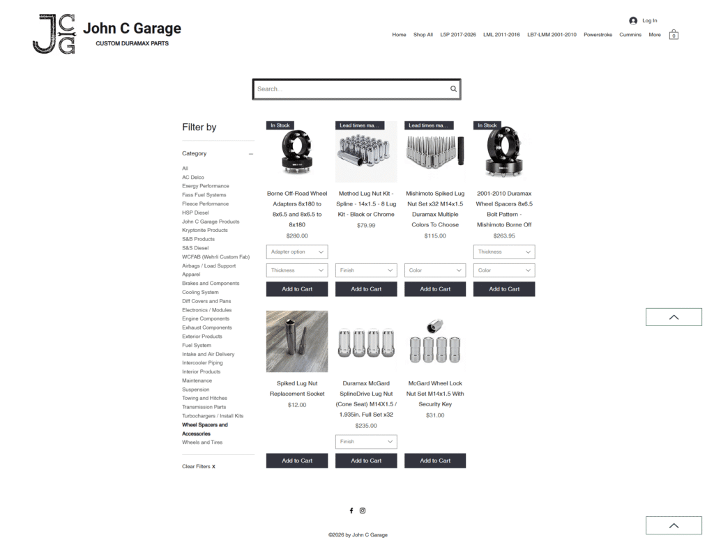
John C Garage LLC had a problem with their website’s structure. The Wix setup didn’t reflect how people in the automotive space shop. Most visitors don’t browse casually. They arrive already looking for a specific part or solution. Instead of supporting that behavior, the category layout pushed them into paths that required additional searches. That mismatch led to unnecessary drop-offs.
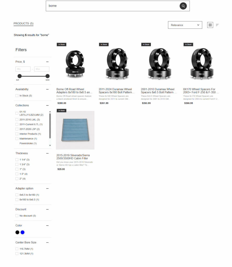
Search didn’t fully close the gap either. It wasn’t tuned tightly enough for product-level discovery, so users often had to rework their queries or fall back on manual browsing. On mobile, especially for users coming from Facebook and Instagram, that extra effort made a big difference in whether users stayed or left.
The website’s visual hierarchy also didn’t guide users in a consistent way. Important actions like finding products, understanding returns, or getting in touch weren’t always easy to locate.
There was also very little built in for bringing users back after they left. If someone didn’t purchase on the first visit, there wasn’t a strong system in place to re-engage them.
People were finding the site. The problem lay on what happened once they got there, and how easily they could actually complete a purchase.
Solution
Web Design & Development
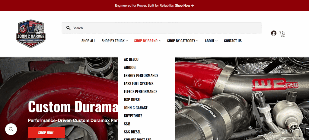
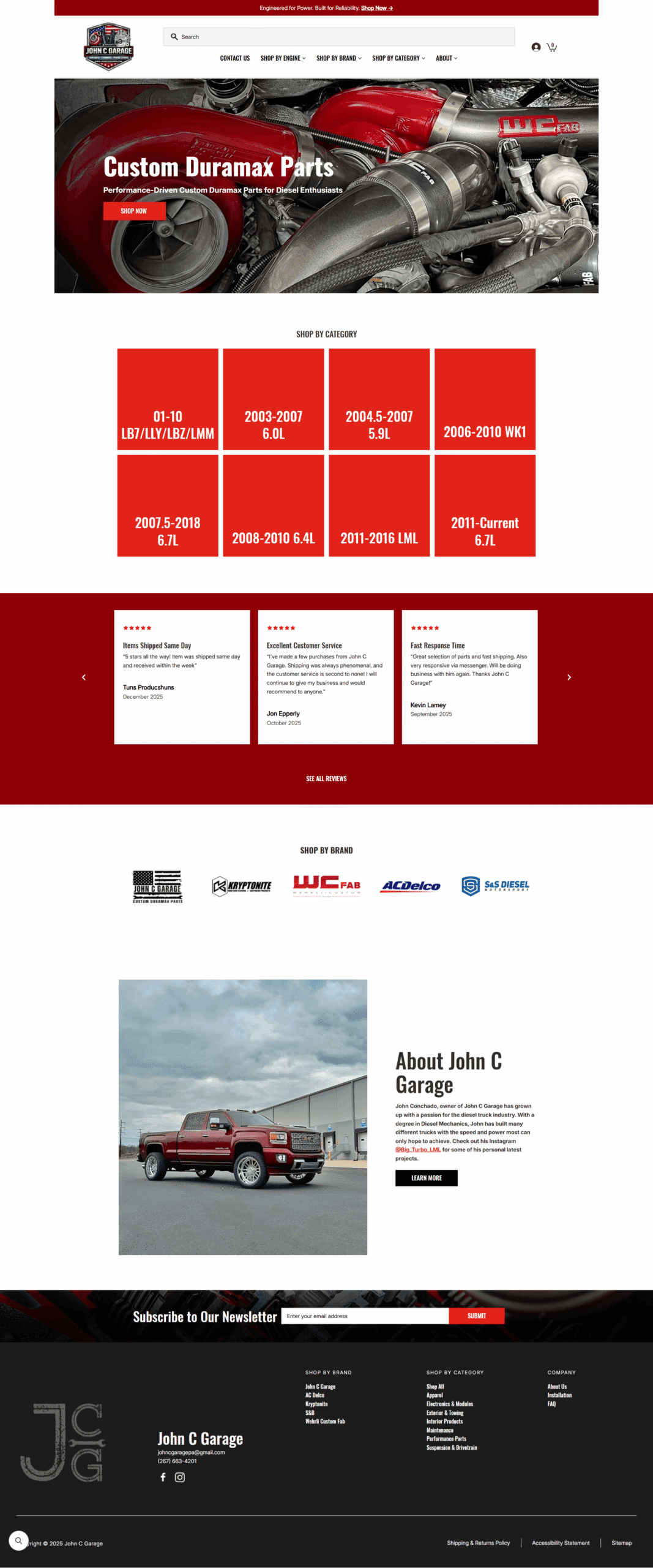
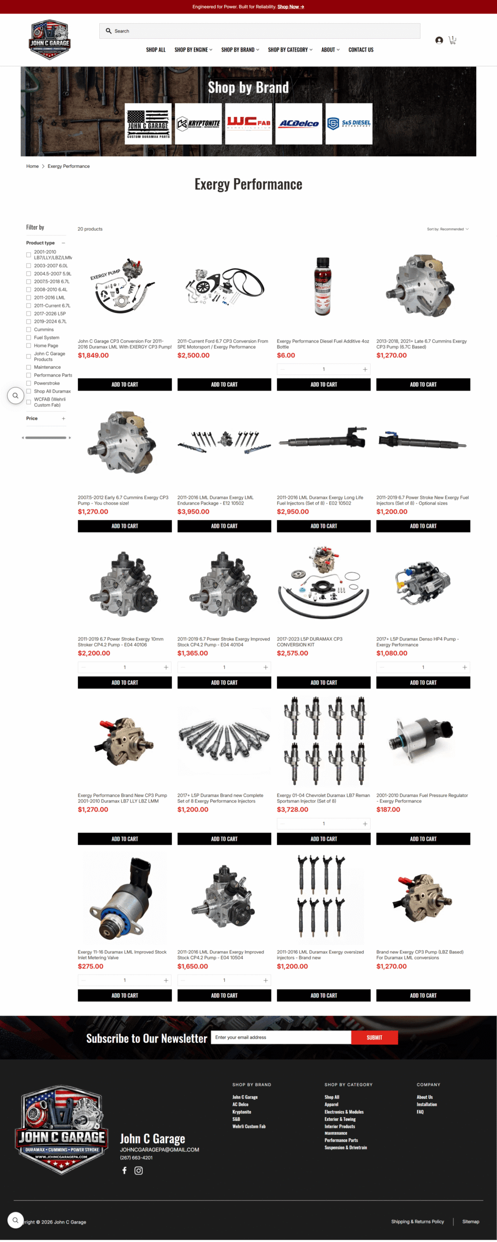
To fix the navigation issues, we reorganized the Wix store and simplified the category structure. We also added a mega menu so customers could get to the right section quickly.
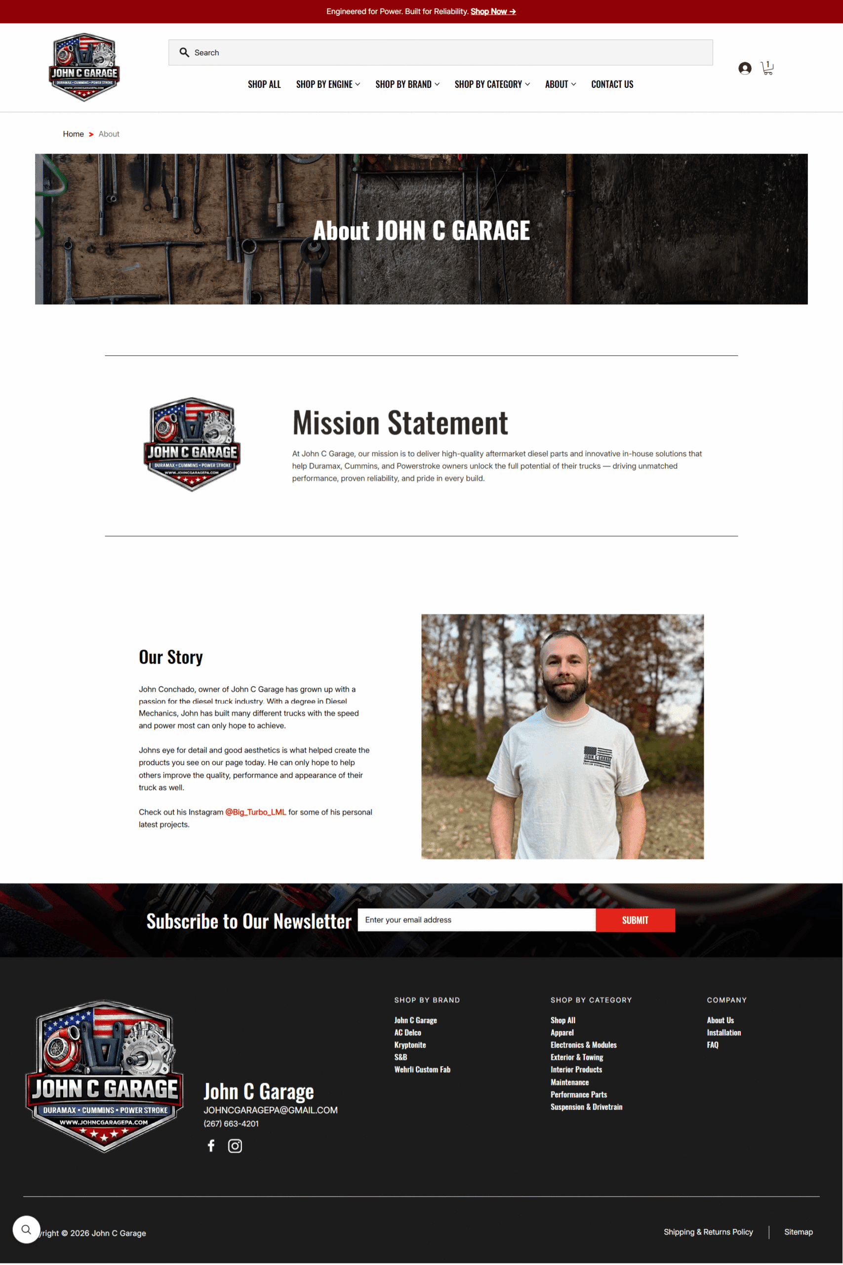
The goal was to make information easier to find and reduce unnecessary steps throughout the site. We updated the site’s main pages as well, including the homepage, category pages, product pages, contact page, returns page, and policy pages. Key details such as compatibility, specs, and fitment information are now more obvious, so customers can quickly tell if a part will work for their vehicle.
We also improved how the site works on mobile. We adjusted the navigation and page layouts to make browsing and buying easier on smaller screens.
Integrations
In this industry, customers often don’t buy immediately. They compare parts, check compatibility, or wait to confirm details. Klaviyo was added so the business can re-engage site visitors instead of losing them after the first visit. It also allows the brand to communicate product updates, promotions, and reminders.
Our developers customized a Wix shipping solution to make checkout and delivery expectations clearer, reducing uncertainty around what happens after an order is placed.
Search and reviews inside Wix were also improved. Search now returns more relevant results, especially for specific parts, and reviews are displayed in a way that helps customers feel more confident before purchasing.
Final Product
Results
After launch, users reached product pages faster and with fewer clicks. The updated navigation follows the way automotive shoppers actually think, keeping more people on the site and moving toward a purchase.
The rebuilt “Shop By Brand” section made a noticeable difference for returning customers. Shoppers who already know the brand they want can get there quickly without digging through categories.
Cleaner product pages and better-placed reviews also helped. Customers could make a decision right on the page without needing to look elsewhere to double-check details.
Klaviyo handled the follow-up side of things. Not every visitor buys on the first visit, and now the business has a way to bring them back with messaging that’s actually relevant.
Shipping clarity was a small fix with real impact. When customers know what to expect after they order, they’re less likely to abandon the cart at the last step.
Put it all together and the site just works better: faster to navigate, easier to trust, and built around how real customers shop.